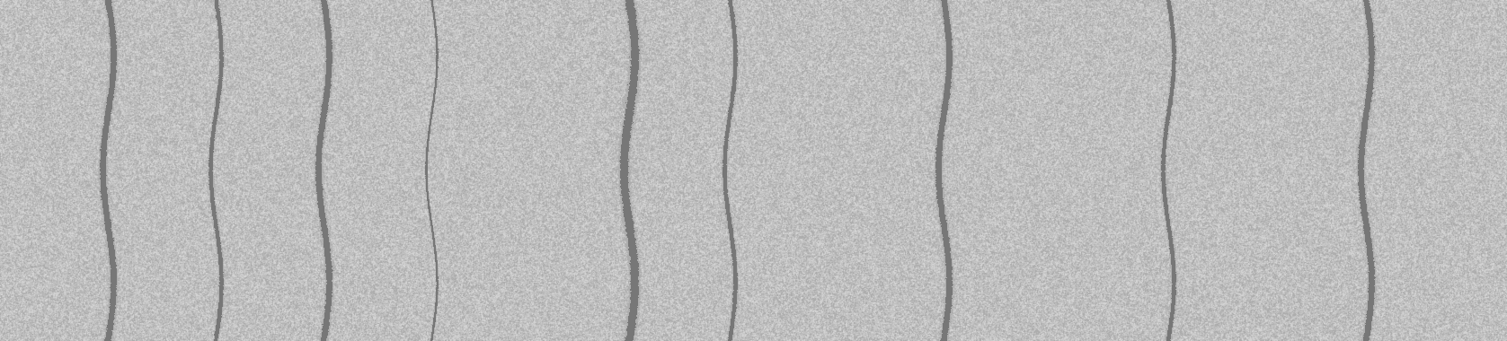
 | |
| time-start | 0 |
| time-end | 60 |
| freq-start | 0 |
| freq-end | 500 |
| image-sizing | legacy |
The problem: a 357 × 366 snippet cut from a 1677 × 380 gram is drawn larger than the image itself, axis labels and all.
The change: an optional config row, image-sizing, chooses how big a gram is
drawn, and its default is now screen:
legacy (before, now opt-in) — one image pixel per CSS pixel; anything
wider than 1200 CSS pixels is cut down to 1200, whatever room the page has.screen (the default, after: the last two grams have no row at all) — one image pixel per screen pixel,
shrunk (aspect kept) only if it would not fit the width available. On a display scaled to 125% or
150% a CSS pixel is 1.25 or 1.5 screen pixels, which is what makes legacy draw a small
image bigger than it is.native — one image pixel per CSS pixel, with the same fit to the available width.
Identical to screen on an unscaled display.Under screen and native every gram gets the expand button, the snippet included; under
legacy only landscape grams do.
Why before may look different here than on the target network: the legacy large gram is 1200 CSS pixels wide. On a 1920-pixel screen scaled to 125% the window is about 1536 CSS pixels, so 1200 nearly fills it; on a wider or unscaled screen it leaves a gap. Compare the scale factor below with the target network's.
This display: … screen pixels per CSS pixel, window … CSS pixels wide. Under each gram is the size it is drawn at, in CSS pixels.
| |
| time-start | 0 |
| time-end | 60 |
| freq-start | 0 |
| freq-end | 500 |
| image-sizing | legacy |
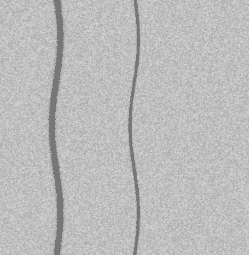 | |
| time-start | 0 |
| time-end | 58 |
| freq-start | 185 |
| freq-end | 291 |
| image-sizing | legacy |
| |
| time-start | 0 |
| time-end | 60 |
| freq-start | 0 |
| freq-end | 500 |
| |
| time-start | 0 |
| time-end | 58 |
| freq-start | 185 |
| freq-end | 291 |