The check worked, and the drawing still had to go
The background
Every architecture diagram starts accurate. Then something lands, the picture does not change, and nothing says so. Code that drifts from its callers fails a test; a drawing that drifts just lies quietly, to exactly the readers who trusted it most. So — can a diagram be made to fail?
The requirement
The first tab a visitor opens was a numbered list of what had been built: a changelog, written for someone who already knew what the thing was. It had to become a picture of the shape, grown one part at a time under the arrow keys, and stay true with nobody maintaining it.
The options considered
It can. Four passes drew the declared parts, labelled from configuration and wired from the real topology, and a build check failed on any part the picture had not decided about. It fired the week it was written — a merge added a component, the build named it, and a caption about that component's neighbour turned out to have gone false earlier still.
Then the picture was made abstract: six roles, not one component named. All of that retired with it. The check was never wrong; it was propping up a claim the page should not have been making — these are all the parts — which another tab already answers properly. A drawing that names nothing cannot go stale, because it never said it was the list. The repair was a smaller claim, not a stronger check.
The demo
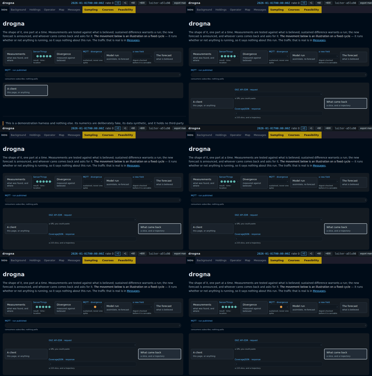
The clock is pinned at zero throughout and the messages move regardless: an illustration on a fixed cycle, not a readout. Open it, press the right arrow six times, and click something crossing a gap to read it.