drogna

A demonstration harness. Every number in it is invented.

The weights were there, and thrown away

The background

An operator asked to trust a forecast asks one thing: what is this number made of? Not which model ran — which measurements moved it, and where the rest came from when nothing sampled it.

The obvious answer is to ask the system that combined them. Ours could not: it knew, and threw it away.

The requirement

For the water column a reader picks, a line to every instrument that reached it, each as wide as what it contributed — and beside it the two numbers behind that width: how far the reading was from the cell, and how its error compared with the forecast's.

The options considered

The tempting fix was to work the split out in the browser, from the instrument positions and the declared correlation. It looks equivalent and is not: a second copy of the arithmetic, free to disagree with the first, and a picture that adds up by construction proves nothing about the analysis it claims to show.

The real fix was smaller. The kernel builds each weight row by row, then reports only the total. We kept the rows.

Then the surprise. The influence radius bounds the covariance, not the gain — so a cast beyond a cell still moves it, through its overlap with one nearer. That part has nowhere to draw a line from: a band, not a ray.

The demo
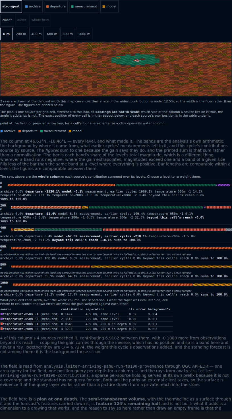
The forecast tab's centre region. At the top a chooser of the four provenance shares; then a row
for how close the field is drawn — closer, wider, whole field, the last two greyed because the view
is showing all of it; then a depth control reading 0, 200, 400, 600, 800 and 1000 metres, the
analysis's own levels, with 0 m chosen. Below it a map of the grid at that depth, mostly
rust-coloured hatching where the departure forecast still dominates the field, with a green patch
where the platform has been sampling; a pale ring marks the picked column and the four
instrument-sources that reached it are marked immediately beside it, because the platform's two
instruments sample the cells it is crossing and every source is within a cell or two of the column.
Under the map a line saying two of the rays are drawn at the thinnest width the map can show, their
share of the widest contribution being under 12.5%, so the width is a floor rather than a figure;
then a line stating that the plan is one square per grid cell stretched to the box, so which side of
the column a source lies on is true and the angle it subtends is not. Beneath that a depth profile,
one stacked bar of hatched bands per level with its figures printed underneath. At 0 m the gain
extrapolates hard: archive 0.0%, departure −2130.1%, model −0.1%, measurement from earlier cycles
1969.1%, then this cycle's four sources — the 50 m instrument's two casts at 14.2% and 237.3%, the
200 m instrument's two at 0.2% and 9.4% — and beyond this cell's reach 0.0%, summing to 100.0%. The
bands run in the same order as the table at the foot. At 600 m, 800 m and 1000 m an italic line
states that no observation was within reach of that level, because the correlation reaches exactly
zero beyond twice its half-width; the 600 m bar is the departure forecast alone at 100.0%, and the
800 m and 1000 m bars are departure beside model at 35.9%/64.1% and 82.3%/17.7%. At the foot a table
of what produced each width: each source with its contribution, its separation from the cell in
kilometres and in depth, its own declared error and the forecast's at that cell — and a closing line
reading that 4 of this column's 4 sources reached it, contributing 6.9182 between them, with −0.1808
more from observations beyond its reach, together ω = 6.7374.

Pick a square. The lines are the instruments that reached that column, each as wide as it counted; pick a depth and they re-weight without moving. Every figure is printed too: a platform crossing its own cells stacks its sources. Here six contribute 3.86 and the band beyond reach −0.07, against ω = 3.79 — the gain extrapolating, at magnitude.

Open it at the Forecast tab